Module 5 Project 1
Q1)
What geographic area are you studying?
Maricopa County, Arizona
Q2) What decision do you need to make?
Select a neighborhood to reside considering the four following elements: distance to Chandler Regional Hospital, distance to Phoenix college, a neighborhood with a high percentage of 40 to 49 year olds, and a neighborhood with high house values.
Q3) What information would help you make the decision?
Maps to gather distance to the first two elements of the constraints above. Census data can determine neighborhood age, and real estate data for Maricopa County.
Q4) Who are the key stakeholders for this issue? (This step is important. You need to know the audience for your analysis to help decide how to present your results.)
Mid-age professionals. I am carefully looking to see if there are children.
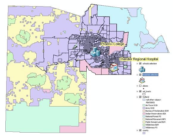
| Layer | Data Type | Publication Information: Who Created the Data? | Time Period Data is Relevant | Spatial Horizontal Coordinate System | Attribut Values |
| places | Point | Tele Atlas North America, Inc., ESRI | 2004 | GCS_North_American_1983 | Demographic Data |
| schools | Point | Tele Atlas North America, Inc., ESRI | 2004 | GCS_North_American_1983 | Place Data |
| sel_tracts | Point | Tele Atlas North America, Inc., ESRI | 2004 | GCS_North_American_1983 | Census Data |

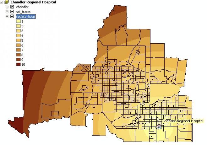
Q6) What do the different colors mean?
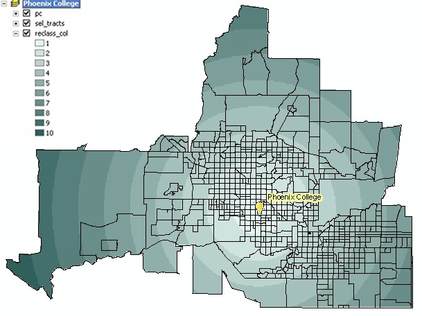
Q7) In what unit are measurements reported and how do you know?
Q8) Click on the measuring tool. From the pull down menu within the measuring tool, select Distance and then Miles. Using the measuring tool, measure the color bands. How many miles does each color band represent?
Q9) Which value is closest to the hospital, 1 or 9?
Q10) Which value is closest to the school, 1 or 8?
Q11) Are there any tracts that have 0 percent? Why or why not?

Q12) Are there clusters of census tracts that have a higher percentage of population 40–49?
13.762098% of the population are between 40-49. This was gathered by dividing the 40-49 year old population by the 2000 Population.
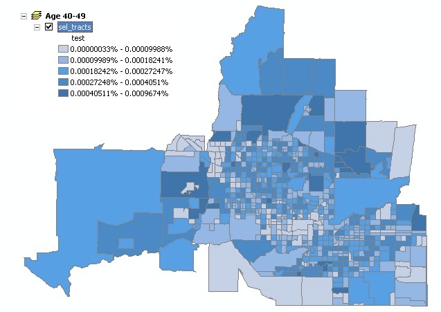
Q13) How can a census tract have 100 percent population age 40–49?
If people between the age of 40-49 are the only residence of that census tract.
Q14) Where is the median house value highest?

Q15) For this first scenario, what should the percentage influence be?
Equal, 25% for each influence.
Q16) What is the scale value?
¼ , 25%.
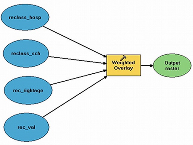
Q17) What is the couple's priority concerning the hospital?
25% of the whole decision.
Q18) How do the distance values vary from the hospital moving outward?

Q19) Explain the pros and cons of each analysis.
The price of gas would seem to influence how much the the couple would weigh the distances from the Chandler Regional Hospital and Phoenix College. But having this model would allow for easy readjustments of the places they should look to live.